InsideTrack~3 min readEnterprise Supply Chain / Procurement

When Growth Outpaces Structure

TL;DRAs the sole product designer, I transformed a fragmented enterprise product into a scalable platform by redesigning its navigation, information architecture, and first design system.

Role

Sole Product Designer

Team

Engineers · CTO

Owned

  • Design vision
  • UX & UI Navigation
  • Information Architecture
  • First design system

Result

12+ fragmented experiences
→ 1 scalable navigation system

01Challenge

The hardest problem wasn't redesigning the dashboard. It was discovering what actually needed to change.

The product had grown organically for years in an engineering-led organization without dedicated design ownership. Rather than redesign screens independently, I first had to determine which structural problems created the most downstream complexity.

The work required balancing four constraints:

Limited user access

Direct customer access was limited, making Client Managers the closest window into real workflows.

Engineering-led product

Years of independent feature development created growing UX debt across the product.

Compressed timeline

The first six months were spent delivering features, leaving limited time to redesign the product's foundation.

No product owner

Without a product owner, I partnered directly with leadership to define product strategy, priorities, and UX direction.

02Evidence

Contextual Inquiries

Since 70 to 90% of clients work with a Client Manager, their view was the closest proxy for the user's.

The pivot

The read

Fix the dashboard

Leadership wanted more flexibility, a more modern aesthetic, and to resolve a dashboard-within-a-dashboard workflow.

What I found

Overload, not features

The pattern wasn't missing features. It was overload: "the portal has so many paths to get to things."

Heuristic Review

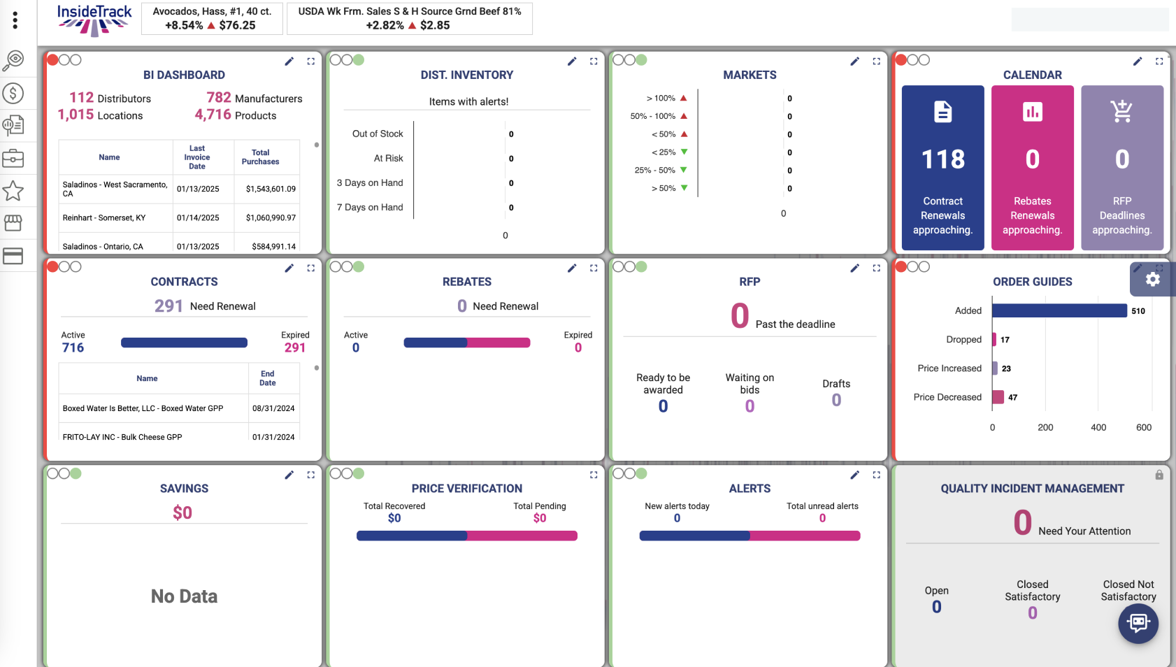
A full pass over the existing product, flagging where hierarchy, consistency, and structure broke down.

  1. 1Navigation was inconsistent.
  2. 2Information lacked prioritization.
  3. 3Pages competed for attention.
  4. 4Workflows broke down.
  5. 5Visual hierarchy was weak.
  6. 6Content lacked structure.
InsideTrack's original BI dashboard, a dense grid of competing widgets

Following the Workflow

Mapping workflows to surface underlying point of friction in the product.
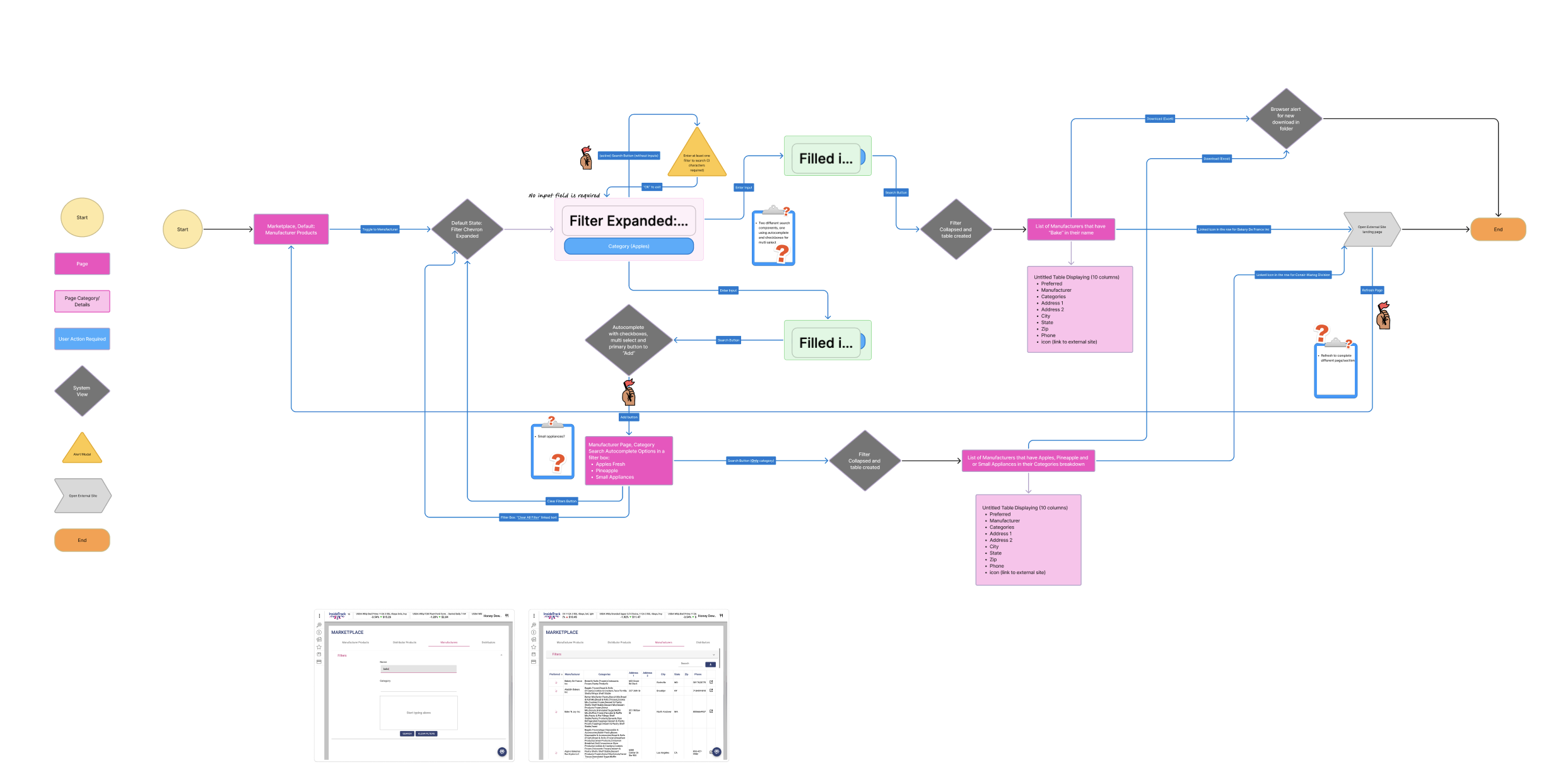
A marketplace journey map annotated with user friction points and open questions

The dashboard wasn't the root problem. It was navigation and information architecture.

Across every research method, the pattern was the same. Users weren't struggling because the dashboard looked outdated. They were struggling because the product lacked a coherent structure. Improving the interface alone wouldn't solve the problem. The foundation had to come first.


03Foundation

A foundation for every workflow.

The dashboard wasn't the deliverable. The foundation was. The lasting work was a shared navigation model and design system that every future workflow could build upon.

  1. 1

    Search

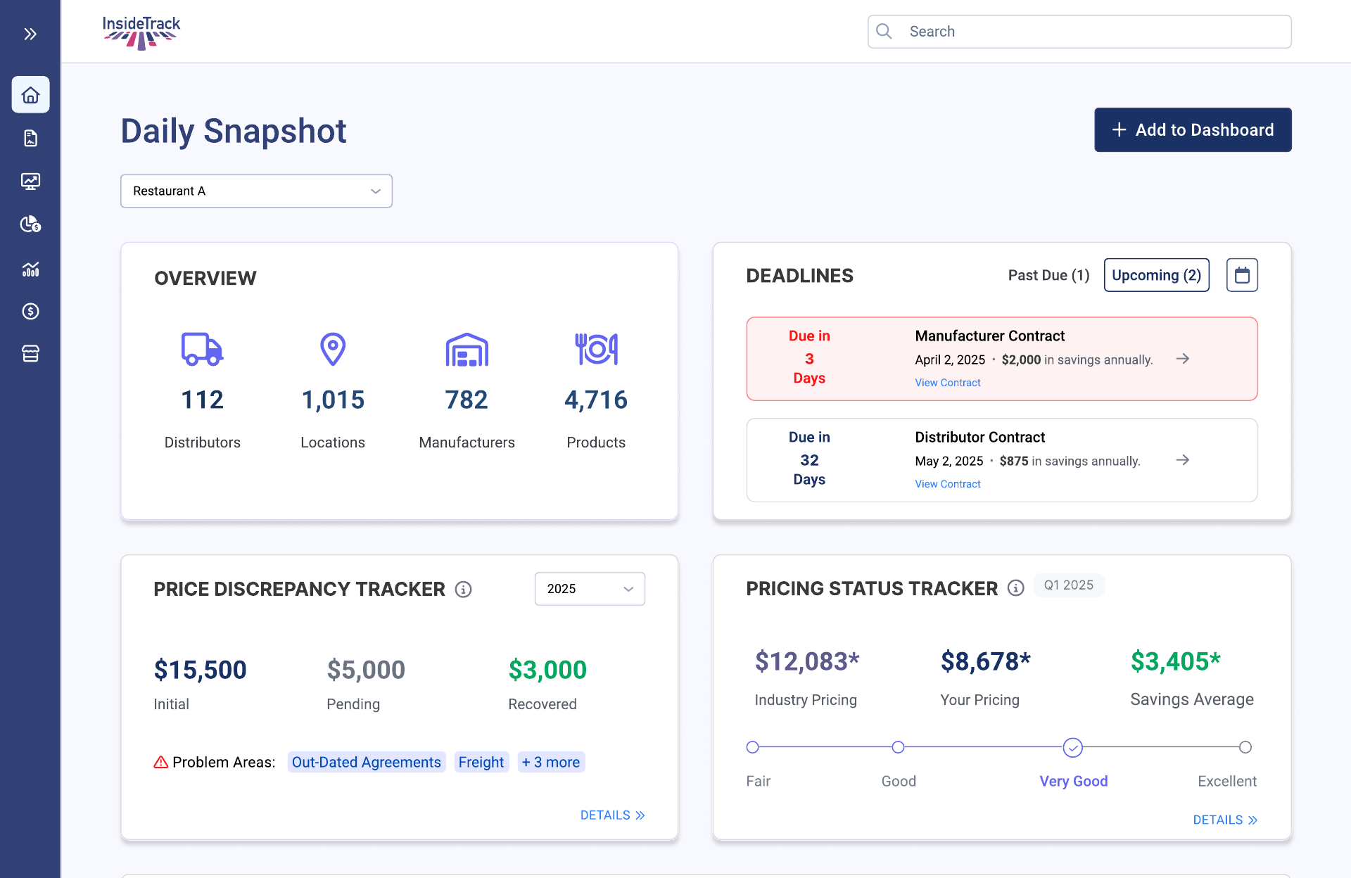
    Find contracts, distributors, and records without navigating multiple modules.

    Global search bar
  2. 2

    Location switching

    Move between enterprise locations without leaving the workflow.

    Location selector dropdown
  3. 3

    Dashboard customization

    Surface the information most relevant to each user's role.

    Add to Dashboard button
The redesigned Daily Snapshot dashboard

04Impact

A foundation the team could build on.

Unmoderated testing confirmed the shift: users found their data faster and understood the interface more easily.

12+fragmented experiences
1shared navigation model

Created a consistent foundation across the entire product.

0design system
1stshared design system

Established reusable components and interaction patterns for future development.

The redesign shipped as a unified product experience built on a shared navigation model and InsideTrack's first design system.